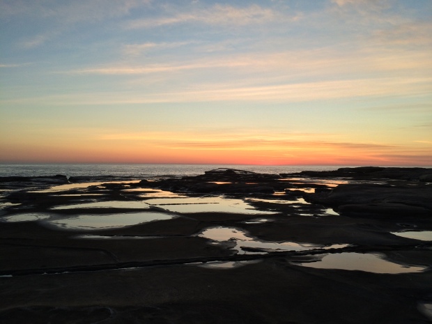
TLDR: Despite what the feature image of this post might suggest, this is actually about my iconography for the weather screen in the somewhereville app.

TLDR: Despite what the feature image of this post might suggest, this is actually about my iconography for the weather screen in the somewhereville app.

TLDR: Being limited to two colours meant using different shades, due to the nature of the information my interactive was about, I knew red would definitely be one of my colours.

TLDR: This post is entirely a remake of the pdf I submitted for the interactive data assessment, but in blog form. It is a 35 page pdf as it includes images of every screen for said interactive, so all images have been omitted from this post to save space, apologies if this abstraction is unclear as some parts are written to directly address images.

TLDR: I don’t remember much of the feedback but if I did this project again I would look for a way to minimise the number of screens and stop the lagging of the interactions.
Moving on from that for 3.5, from my class mate’s blogs that I have observed it seems no one really assessed my interactive for constructive feedback on the usability, and with myself falling behind, it would seem quite futile to give such feedback to others now that the project is well and truly over, so instead I will reflect on my own assessment, which is the basis of 5.1.

TLDR: A short post that explains how my prototype works.

TLDR: After hours of research and thinking about it, I don’t like any of my ideas, and after leaving class on my way home, BAM! hit with an idea of a place to focus on that I love, Sunset Valley.

TLDR: I used guides in illustrator to format my own grid for this project, to make sure everything was aligned correctly down to the pixel.

TLDR: I made a representation of a world map, it’s probably not accurate, but it gets the point across.
This blog has been started to document my design process throughout the second semester of 2016, in my second year of tertiary study at the University of Newcastle.
Currently, I would like to believe I will carry this blog into the future and throughout the rest of my study as well into my career, or perhaps just following any design projects I undertake. However as this is my first experience with blogging in any way I am quite cautious about providing engaging material or knowing what to say, therefore I consider this, the first post in said blog something of a new beginning.

TLDR/Summary: There’s so much information out there and much of it is visualised in one form or another, interactive wise, charts and graphs seem the most common. I’m not worried about forming the interactive data visualisation currently, however I am concerned about what data to choose for it.
PS: The Nikon Universal (3) and Every Noise at Once (10) are soo worth checking out.

TLDR: I chose idea 4 to pursue, the worldwide locations of cryptids/urban legend monsters, using a world map style infographic and sketchy styled images.

TLDR: I chose a drawing style I didn’t want to use seriously and upon digitising the images it became exactly what I had originally imagined. The bottom of this post includes ‘before and after’ style displays of the images made for this assignment, and I adore the final outcomes.
