
TLDR: This post is a summary of the class experimentation with paper prototyping and my feedback and reflection from the somewhereville app pitch as presented in class.
So in short, due to irremovable factors I missed the week eight classes in which the concepts of paper prototyping and testing were examined and experimented with. So since I missed it and feel it would untrue to…for lack of a better word, bullshit the post, I instead have combined that week’s post with the next week’s post in which we pitched our current concepts for the somewhereville project to the rest of the class. The reason this works is due to missing the previous class I felt I had to make a paper prototype for the presentation, even though I didn’t cover it in depth.
I have provided a slideshow containing the slides I included in my pitch presentation.
As for reflecting upon the feedback, which a requirement for this post, at the end of my pitch I was met with complete and utter silence, whilst I joked at the time that ‘well-p it must be perfect nothing needs improving then’ I found the lack of criticism constructive or otherwise very off putting, the class had been extremely forth coming with all presenters before me and to have no suggestions even, makes me question my presenting skills, that I was so unable to explain my ideas that no one could even comment on them. The excuse that was offered was that I am using a fictional place and because not many people in the class know it they can not comment on it. which I find to be a weak excuse as the assignment is not about the place at all, it is about the app, not to mention that a made up place had already been pitched and received feedback, and 3/4 of the following fictional places to be presented after me (that I remember) also received copious amounts of feedback.
The tutor of course did provide some feedback at least, it was primarily orientated around editing my colour palette, & having a lot more to do, which is obviously true, and I did follow on to adjust my colour scheme accordingly.
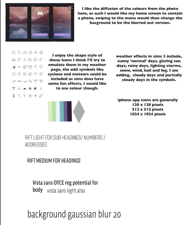
As you can see in this screen shot of my app planning, which is just a messy file for me to refer back to and probably not one that should be published, I basically scrapped the revised colour palette in favour of the original, only keeping the stronger blue colour and the grey.
Over all I believe my biggest limiting factor for the presentation was that I had still not decided on the overall aesthetic of the screens on the app, not to say I hadn’t done any designing for it but rather every design I came up with I found lacking. Another note was that I included the CMYK colours rather than RGB even though I know better, it is just habit for me to list CMYK and I didn’t think about it. I have also in retrospect changed the device I am designing for, I am now working for my own model of phone, iPhone 5s as I find it much easier to design the screens in direct relation to a screen I can physically observe.
